
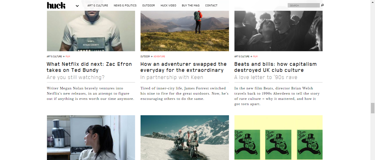
On the front page, the masthead is on the right hand side of the website which is conventional. The navigation bar is next to it, in a conventional place. There is no sidebar. The navigation bar is split up into 6 categories. 3 are article categories and the other 3 on video, buying the magazine and contact. A bar at the bottom which follows when the user moves down the page has social media links and an ‘events’ link, which is unconventional.
The main body of the front page has a slideshow with two images, one linking to the main article and another linking to the most recent copy of Huck. The article advertised on the webpage is a different article to the one on the front page of the physical copy, which could help sell more physical copies of the magazine. The main image is of an older man, with no direct address, which is unconventional as well as the editing of the image, which shows the target audience.
The colour scheme is basic: black and white. This colour scheme is used on physical copies of the magazine, which helps to create a clear brand identity. The colour scheme is minimalistic and shows the target audience is older, more intellectual people who do not need bright colours and designs to pull them in. The font choices are modern and sans-serif, like the physical copy of the magazine and fit with the indie and contemporary look.
As the user scrolls down, various articles of different genres and topics are placed in easy to read and identify boxes. The font is the same sans-serif contemporary font which helps with keeping a clear house style and brand identity.

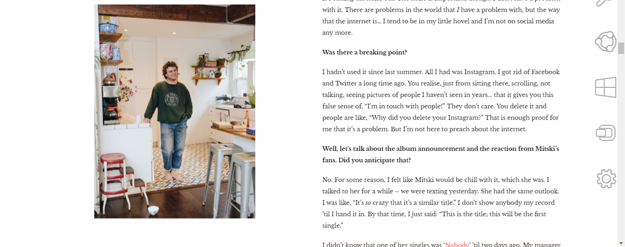
The main feature article of the website features a full screen photo with the article title in a modern, white, contemporary font that is featured throughout the website and the physical copy. The image used is of the model in a reflective pose which hints at the topic of the article. The model’s name is used in the title which helps bring in readers.
The main article itself is structured into a question and answer format, with the questions in bold and the copy in normal weight font. This makes the interview easier to read, and may be due to the fact it is on a website. The copy is in a traditional serif font which is conventional for articles, and shows the target audience. An image stays in the same place as you scroll down the article, which is a modern feature. When reading the article, there is nothing on the sides which make it seem minimalist and indie.
